

Are you interested in the full box of Stampin' Write markers, but you are on a budget? My Marker Club is the perfect solution!! For $50 a month (for 5 months), you will receive a color family of markers and anything else you wish to bring your order up to $50 (before shipping and taxes). Each member will be the hostess during one of the five months. As hostess you receive the marker case and hostess benefits. At the end of the five months, everyone has a full set of markers and other amazing goodies added to their scrappy/stamping collection. At each club get together, we'll be doing something new and fantastic with the markers! Club nights will take place at my home studio! Call me or Email me to sign up! |
14 comments:
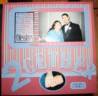
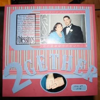
I like the second one! I think the design beside you add something special to the picture.
Of course, both are still nice...
They are both beautiful pictures of the two of you, also really nice layouts (great job). I like the second layout as it adds character to the picture. But like I said both are really nice layouts
I like the second one as well. It makes the layout more "complete", and fills up what seemed to be a "blank" spot on the layout.
Lizzy
The second. The first one is also great, but the extra scroll on the photo helps to put focus on the two of you as opposed to empty wall behind you.
http://inkinwithval.blogspot.com
I like the first one. I think the scroll takes my eyes away from the photo.
Colleen
I also agree...the second one for sure! Love the little swirlys!!
I like the second one :) but they are both great! You are so creative!
I like the one with the flourish, it just adds something to the total feel of the layout.
The swirls add a nice touch KA!! I like that!! Great layouts!!!
I like the 2nd one best. I think the flourish helps draw the eye to the picture and it 'fills in' the picture a bit more.
Flourish my friend!!! Love the added flourish on the second one!!!
I like the florish cause it distracts from the vertical line in the picture behind you. Looks great otherwise!!
I like the second one as the flourish you added helps to make the background more detailed rather than being gray.
Both of the layouts are really nice.I like the second one as well.
Post a Comment